With the whole world of visual culture now at our fingertips, why does everything feel so hollow?
A couple of weeks ago I wrote about the feed and the flattening effect it has on culture. I’m feeling this theme of flattening as a broad direction of travel for this era we’ve started to call Late Stage Capitalism (wishful thinking, perhaps). I think it’s interesting (and hopefully not too depressing) to think about how this has surfaced in graphic design and brand communication.
One of the first examples of this kind of mass media flattening shows up in the development of political branding, specifically The Obama campaign of 2007/8. This marked the introduction of corporate graphic design and branding techniques into the political sphere, and kicked off its own trend within the branding world.
Obama’s campaign really utilised the connected, consistent, guidelined approach of a startup in a big way. Political campaigns have always sought to have their own distinctive voice—and to stand apart from the other guy—but this is the first time we saw such a branded campaign, complete with its own corporate logo.
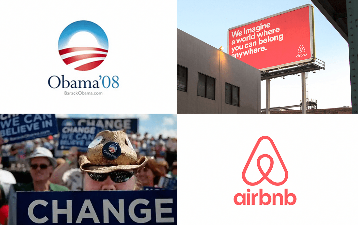
The campaign’s use of Gotham established a since-ubiquitous typography style, which communicated a general sense of friendly but not-too-scary optimism. It aimed to reassure its audience that while we crave positive change, it won’t be too radical. It could say “CHANGE” in a friendly, accessible-yet-impactful font, just bold enough to sound like it means it, but not chunky enough to evoke connections to the art and design of 20th century political movements that some might consider too ‘extreme’.
It was enough in 2008 to say CHANGE and not really back it up with anything meaningful, but the disappointment of Obama’s terms in office has since made this approach feel somewhat hollow. So perhaps it shouldn’t have been surprising to see Hillary’s campaign try to replicate this approach in 2012 with disappointing results.
This aesthetic did however prove a perfect fit for the startup boom of the 2010’s, with major “disruptors” adopting it as their house style, echoed for example in the startup-optimism and simplicity of DesignStudio’s 2014 rebrand of Airbnb. Their inoffensively positive aesthetic allowed them to couch aggressive, often destructive and unethical business practices with a bright, friendly, progressive sheen.
I remember doing a lot of business-to-business branding at the time—it was like a race to see who could find the next bold humanist typeface that had just enough quirk to be able to say it was different from Gotham (then Brandon, then Brown, then Circular, and so on…)
[side-note: this also spurred a glut of experimental sans fonts that no-one would actually use, documented in this very much of-its-time tumblr]
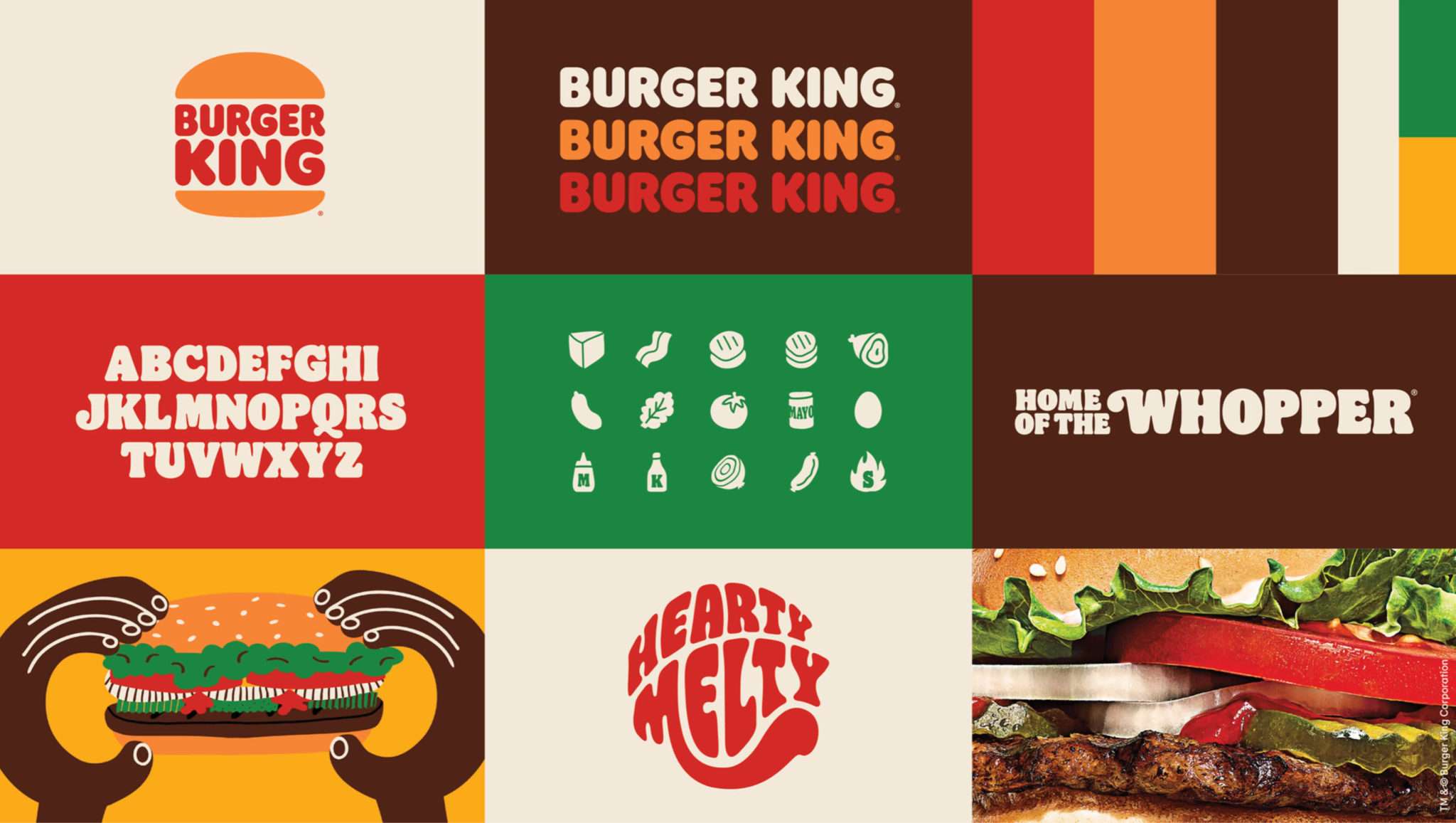
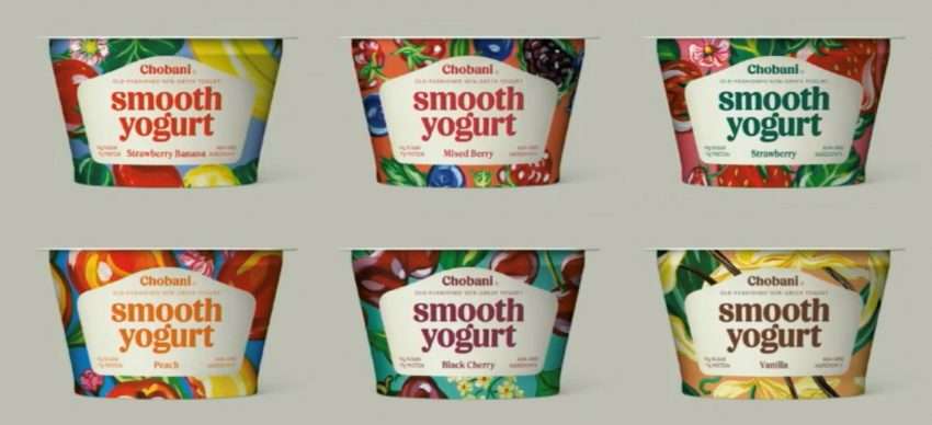
The time since this slick, optimistic period of design has seen something of a backlash in typography, seeing cycles of 70s inspired ornate slabs and serifs, dipping in and out of psychedelia, much of which has made its way into some of the biggest, most corporate of rebrands, and is now arguably the new bland.
This has been spurred on by an increasingly visually sophisticated and design-literate public, ever more comfortable creating their own personal brands, empowered by Canva and similar tools.
You could argue this indicates a golden age of pluralism in design: a multitude of styles to represent a multitude of expression. But as with most things under capitalism, I think this choice is an illusion. What’s been created is essentially a market of off-the-shelf styles and easily replicable templates, whose value is gradually becoming flattened to the lowest common denominator. It’s made it increasingly hard to actually be distinctive—as soon as an interesting visual style or illustration trend pops up it’s hoovered up by the branding machine and spat out in the form of a brand that sells mortgages. It’s a post-modern cliché that there are no movements anymore, but it’s a facet of meta-modernism that there’s a mini-movement for everyone to buy in to.
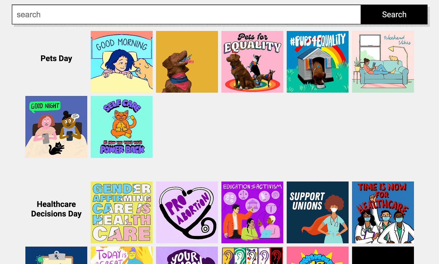
Ever since the Black Square overtook Instagram, it’s been understood by many that to post is to act; and to act is to post carousels of text calling people out for not acting.
In the past few years a cutesy, meme-able graphic style has proliferated, pioneered by social justice movements on Instagram and Giphy, and adopted by the US Democrats as an unofficial house social media style. This goes hand in hand with the rise of Procreate as a means to quickly create hand drawn illustrations— a development that’s also worked its way into corporate branding. I’ll save the rant about how we all now willingly work for free for social media platforms for another day.
So now we’re surrounded by visual stimulation—a plethora of styles with any substance surgically removed to where any interesting new visual approach rings as hollow as those old Gotham-emblazoned placards. A flattening not in terms of how things look, but in how creativity indicates any kind of value or substance over any other product, service or belief.
But I did not intend this to be some Graphic Designer’s lament!
I think if there is a way through this, it’s in really connecting with the substance of the thing you’re designing for, and tying your artwork inextricably to that. Burger King looks like a 70s soft-play area today because it wants to evoke nostalgia and associate its brand with that cosy feeling, and because we’re simply bored of corporate sans serifs. They do not make 70s inspired cuisine—they are not, and never will be Big Kahuna Burger—in fact nothing about their product or service has changed. These companies have to hijack trends because they don’t actually mean anything to anyone. In the same way, the political establishment cycles through graphic design styles because they’ve got nothing to say.
Us designers love to hark on about that modernist phrase Form Follows Function, but maybe the mantra for this meta-modern age should be Style Serves Substance—using cues and techniques that directly reflect, enhance or spring from the content and meaning of the subject.
If you’ve found this at all interesting, consider sharing it with your friends and colleagues, so I can measure my self-worth in substack stats 🙂
I’m trying to write regularly, at the moment once a week. Subscribe to see if I can keep that momentum up!
Leave a Reply